It’s no secret that series branding is essential in the publishing business. Well, let me rephrase: It should be no secret that series branding is essential in the publishing business.
But knowing something needs to be done and executing it properly can be two very different things. This is why I’ve started co-teaching cover design workshops again with Dean Wesley Smith. (More about that in the coming weeks…)
We designers have many options for ways to brand a series. Typography is critical. Organization of the elements essential. And consistency with cover art is a non-starter.
And that’s where things get tricky.
In the days of traditional publishing, art was created specifically for the book. This was a very expensive process, and one fraught with its own problems. If the artist created something totally wrong for the book (or too dark or too ugly…you get the idea), often times, you were stuck with it. Even if you got great art, if you were working on a series and that artist became unavailable for future projects, well, frankly, you were screwed.
But today we publishers large and small rely heavily on stock art. Yes, we run the risk of another book having the same art on the cover. But I’ll be honest, that’s the least of my worries. I rarely leave the art alone enough to have my books look generic.
The biggest problem with stock art arises with series branding. That is, finding enough art from the same or similar artists to keep a series going.
And when you have extremely prolific authors, like I do, that’s a real worry.
And that’s when we really start to get creative.
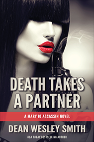 Take Dean Wesley Smith’s Mary Jo Assassin series, for example. We currently have one book published in that series: Death Takes a Partner. So, when I was coming up with the cover concept for that book, I only had the one to go on. This isn’t unusual, of course. A series has to start somewhere, after all. But I know Dean, and I knew he wasn’t likely to stop with the one book. That’s why I insisted we put a series name on the first one from the start (I’ve learned a few things in my five years with WMG :).
The art I chose was compelling, sexy and thriller appropriate, just like the book. I knew I’d be able to find other art like it, but I had no way of knowing how specific I could get for the books themselves since they weren’t even on the radar yet. That was a problem for the future.
Well, that problem presented itself last week, when Dean told me he was writing the next book in the series, Death Takes a Diamond. He wanted to do the Smith’s Monthly cover for that book himself (that magazine is his baby, and he likes to do most of the production himself, too) and he had found a piece of art he hoped would work.
 Here it is. And it does work well with the series, and will look great on the cover of Smith’s Monthly.
But when I was showing Josh (one of our valuable WMG employees who has an interest in learning design) the cover I designed and compared it with the first book, he asked a very perceptive question: Could I make the art look more black-and-white like the first book?
I paused barely a beat before I said, why yes, indeed I can! (Thanks, Josh!)
So, into Photoshop we went. There’s a lot of technical steps involved here, but I’ll give you the broad strokes:
- Using the magnetic lasso tool, I selected the blue eyeball from the original art and copied it into a new layer, which I placed over the original art.
- Going back to the original layer, I converted it to black-and-white and applied a warm photo filter.
- Next, I used the magnetic lasso to select the diamond (in its now black-and-white form) and pasted it into a new layer.
- Then I sampled from the blue in the eyeball layer and used the color replacement tool to wash the diamond with blue.
- And voila! Perfectly branded series art.
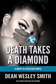
I sent showed the new art to Dean, and he was blown away (which doesn’t happen often and is a pretty cool reaction to witness <g>).
Series. Branded.
I’ve already started playing with art for a future book. So, Dean better get writing.
In the meantime, I can’t wait to see this one in paperback.
Allyson Longueira is publisher of WMG Publishing. She is an award-winning writer, editor and designer.